Zapfino, you’re on notice!
I really like Zapfino. It’s one of the few truly calligraphic typefaces I’ve seen; most of the others (e.g. Mistral) are too regular, too regimented to really resemble handwriting. It helps that it’s included with OS X (as of 10.3 Panther), making it readily available to computer users of taste and distinction.
Problem is, too many people are starting to use it. I’ve seen it:
- on a package of Trader Joe’s pasta
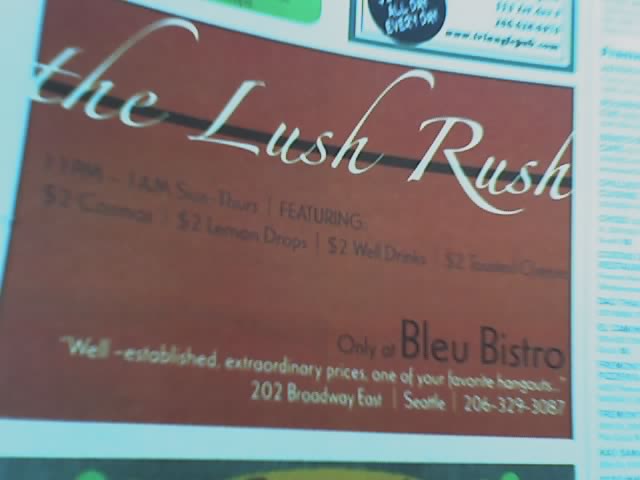
- in an ad for a late-night happy hour in The Stranger
- in some of the promotional displays of Gaiam (permanent image)
- as the logo for a Pottery Barn line (permanent image)
- and even on a bathroom fixture package (permanent image)
(Fractally geeky confession: I specify it in the stylesheet for a wiki for a D&D game I’m running.)
Other people are noticing the same phenomenon.
When the same font (and not something classically neutral like Helvetica or Times Roman) appears in so many different places, it gets to be a problem (though it will never be on the scale of the Comic Sans Catastrophe).
Part of the problem, to my mind, is that the designers using the font don’t seem to be aware of its advanced features, in particular, alternate glyphs and ligatures. (From this point on, I’m getting in over my head; I’m no professional designer, and my knowledge of typography is purely that of a dilettante.)
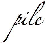
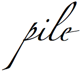
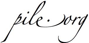
Let’s take a look at the word “pile”. First is with the standard glyphs, and second is with an alternate “e” at the end.

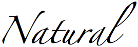
If used carefully, this can really make the typeface look like natural handwriting. Let’s use the word “Natural” as an example. Compare the word below with its use in the Pottery Barn ad at right; in particular, note how this sample’s letters “a” are different from one another.
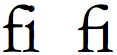
Next, ligatures. One of the standard ligatures is the “fi” combination. If you look carefully in a professionally-typeset publication, you’ll see that when a lowercase “f” and “i” are next to each other, they’ll be joined together; this is a ligature. (In the example below, the first is just an “f” and an “i” next to each other; note how the ascender of the “f” interferes with the dot of the “i”. The second pair is an actual ligature; the “f” has been reshaped to join the crossbar with the “i”’s top serif, and the ascender takes the place of the “i”’s dot.
Using Zapfino in OS X (presumably only in Cocoa apps, but I’m not certain of that), ligatures are automagically used as you’re typing — I got the letter “e” in the following with no extra effort, just by typing the “.”.
While I’ve never noticed this in any use of Zapfino I’ve seen, this could be because I either (a) didn’t notice it, or (b) never saw a sample which had ligatures available in the font.
Anyway.
Back to the point: Zapfino is getting to be overused. Before you choose it for a public application, please be sure it’s really what you want.